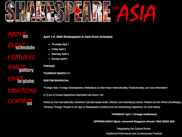
 Sooo Shakespeare in Asia isn't exactly the most enticing thing I've read this week. The website, created by Stanford University, was designed to promote a 2004 initiative on the school's campus centered on Shakespeare's presence in Asia. The webpage features seven individual pages, all with an extremely similar design style. Although the site does convey a lot of valuable information about the event, the layout is a little bit lackluster.
When first reaching the page, one is met with a stark black background with red and white accent colors (these colors aren't going anywhere either). There is a nice graphic at the top, but the rest of the design features gives me a Japanese steak house menu vibe. The opening page could use some spicing up for sure, and it would not have hurt to bump up the font size. There is no immediate emphasis, except maybe the top graphic, and I do not think this bare bones style would persuade a viewer to come to the event, unless already interested. "Unless already interested" is key there. If I was already committed to this event, the website could provide me with all the information I need to know. It has very clear organization with a detailed event schedule, a semi-helpful direction link, a contact page, and a multitude of links leading to more International Shakespeare resources. Although the font may be basic, it is easy to read and the white stands out very clearly the black background. It is not one of those sites that feels like a maze of links either, all the main informative pages are easy to reach and well named. I do not think this site would be difficult to navigate for anyone, which is definitely a positive when trying to reach an older audience. If Stamford was going for a clear and concise website design, they achieved that. I just feel like they could have done more. Coming from the viewpoint of someone who spends a lot of time leafing through different websites, design says a lot to me. It immediately conveys a level of care and professionalism. I understand this website was more than likely created by a student or maybe a small side-job for a website designer, but more variety would not have been difficult to add. Also, I think it is important to take in account after the end of the initiative, the website no longer served much of purpose, so it makes sense to not put in too much effort and resources. Still, a few more pics or even just less uniformity across the webpage could have made the site seem more polished. Simply conveying a message is not enough anymore to impress a viewer, the design elements are almost just as important when trying to attract an audience. The website did a very nice job of breaking down the schedule of events, and providing resources to more information on Asian theatre. It is well organized, simple, and direct. With the addition of a few more colors, graphics, or individual layout styles, the website could jump from basic to really interesting and alluring.
0 Comments
Leave a Reply. |
AuthorWrite something about yourself. No need to be fancy, just an overview. Archives
October 2018
Categories |
 RSS Feed
